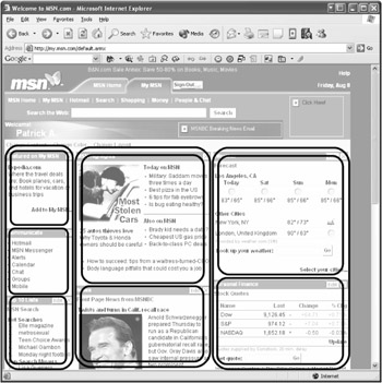
The concept of Web Parts is quite simple indeed. You can define one or several so- called Web Part Zones on your page. They do a great job of serving as placeholders and can carry one or several Web Parts containing the actual content. This way Web Parts can be shown vertically (one below the other) or horizontally (side by side) within a zone. Figure 8-2 shows differentiation based on MSN.com.

Using the view mode of a page, users can minimize a single Web Part to a headline bar, maximize it again, or remove it from the page. If you open a page, this mode is used by default.
If, for example, a user switches over into design mode via a corresponding link button, that user will be able to move a single Web Part within the zone and even across several zones.
Edit mode offers this possibility as well and additionally allows you to blend in a separate Editor Zone through which you may work on several properties of the individual Web Parts. Depending on the number of possibilities you want to give to your users to customize the page, you'll probably go for this mode or for design mode.
The fourth and last mode is catalog mode, which enables you to add new or previously removed Web Parts and show them on the page. In combination with the other modes, users can create a complete and individualized version of the page that will be stored permanently in combination with their user profile.
In the current Alpha version of ASP.NET 2.0, the Web Parts system consists of 11 new controls. And in the final version, there'll be even more. The controls are placed on one page, but their use depends on the chosen display mode. All controls are stored in the namespace System.Web.UI.WebControls. At present, however, a separate Web Parts namespace is being considered. All the controls can be found in the Personalization area of the Toolbox.
The administration of the whole Web Parts system is handled by the WebPartManager control, which has no visualization at all, yet is mandatory for the use of Web Parts. It handles the various zones and the content therein, view mode, and a lot more. You may place only one control of this type on a page.
The previously described zones are defined using one or several WebPartZone controls. Quite often zones are placed within table cells. They'll later take over the content to be shown and have a ZoneTemplate assigned that you can edit within VS .NET as usual. After all this, I'm sure you can easily imagine using Web Parts in combination with Master Pages.
You can add one or any number of server controls, including user controls, as content in a zone. Each control is automatically wrapped in a GenericWebPart control. Thus it can be treated as a Web Part that will allow the user to switch it on or off at a later time. If you want to add several elements instead of one control, the ContentWebPart control is recommended. This one contains a ContentTemplate, which you can edit visually in the development environment.
Used in combination, the three controls will enable you to build a portal in which users can individually move or hide content.
With catalog mode, users may add Web Parts that are new or have previously been removed from the page. To enable the users to do this, you must define a new zone of the type CatalogZone first. With ZoneTemplate you can configure this zone visually in the development environment.
If you place a PageCatalogPart control on the template of the zone, users will have the choice of adding Web Parts that they have previously removed from the page.
If you want to allow users to add Web Parts that aren't yet defined, you must implement one or several TemplateCatalogPart controls first. Each instance of this control type represents a kind of content group. You can add the desired Web Parts within the control by using a template. Apart from ContentWebPart, any other control will do as well.
To edit form and content of displayed Web Parts visually, another zone type, EditorZone, is at your service. This zone is shown as soon as the WebPartManager appears in edit mode and one of the available Web Parts of the page has been chosen for editing. As usual, the zone contains a ZoneTemplate to store the content. At present, four integrated controls do the job:
With the help of the AppearanceEditorPart control, users can influence the appearance of a Web Part at a later time. For example, they can define the size and the title and decide which type of frame should be shown.
The LayoutEditorPart control can be used to define the desired display status of a Web Part (normal or minimized) as well as its membership to a zone together with its position.
The BehaviorEditorPart control can be helpful for users to update the behavior of a Web Part—for example, whether it can be closed or exported.
The PropertyGridEditorPart control offers very high flexibility and can handle custom properties of a Web Part control. This will work under the condition that the developer has marked them as changeable through the Web by using a special attribute.