|
|
< Day Day Up > |
|
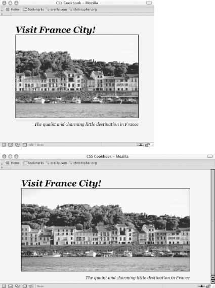
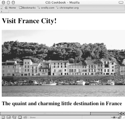
Recipe 10.5 Building a Panoramic Image PresentationProblemYou want the width of an image to increase or decrease as a user resizes his browser window, as shown in Figure 10-9. Figure 10-9. Browser window increased in size to show more of the panoramic image SolutionPlace an image element that refers to a panoramic image into the background of a block-level element (see Figure 10-10): Figure 10-10. Panoramic photo placed on a web page <h1>Visit France City!</h1> <div><img src="frenchtown.jpg" alt=" " /></div> <h2>The quaint and charming little destination in France</h2> Position the image element in the upper right corner of the block-level element and then hide the image by setting the display to none: div {
background-image: url(frenchtown.jpg);
background-repeat: no-repeat;
background-position: top right;
height: 300px;
border: 1px solid black;
max-width: 714px;
}
div img {
display: none;
}When the image is placed as a background image, it will be resized based on the size of the browser window. DiscussionTo create a panoramic presentation, you need a wide photograph. You then need to position the image element in the upper right corner of the block-level element so that the image will grow or shrink depending on the size of the browser window. The use of max-width property constrains the width of the div element from expanding beyond the width of the image itself. In this Solution, the same image is used in both the HTML and CSS. The rationale behind this approach is to make sure the image (or content) displays, even if the user agent rendering the page doesn't understand CSS. See Alsohttp://www.creighton.edu/~jaypl/oldpage/panhow.html for more information on how to create panoramic pictures; the CSS 2.1 specification for max-width property at http://www.w3.org/TR/CSS21/visudet.html#propdef-max-width. |
|
|
< Day Day Up > |
|