|
|
< Day Day Up > |
|
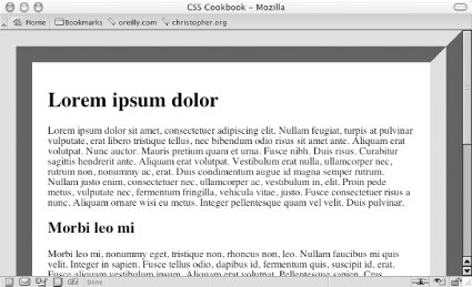
Recipe 2.8 Placing a Page BorderProblemYou want to place a visual frame or border around a web page, as in Figure 2-17. Figure 2-17. A framed web page SolutionUse the border property on the body element: body {
margin: 0;
padding: 1.5em;
border: 50px #666 ridge;
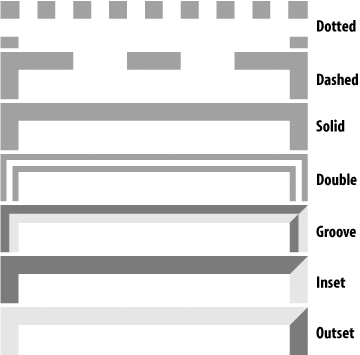
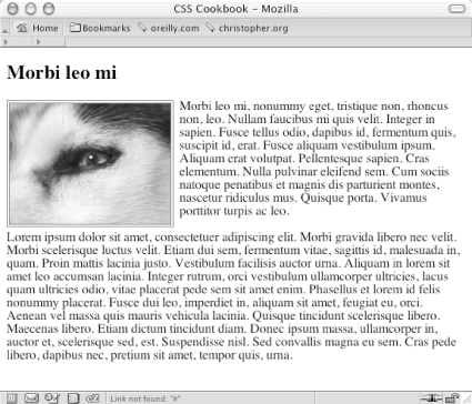
}DiscussionThe border property is a shorthand property, in that it enables you to set the width, color, and style of the border around an element in one step instead of three. If you didn't use this shorthand property in the preceding Solution, you would have to replace the line that reads border: 50px #666 ridge; with the following three lines: border-width: 50px; border-color: #666; border-style: ridge; You can create a framing effect with other styles as well, such as dotted, dashed, solid, double, groove, inset, and outset (see Figure 2-18). Figure 2-18. The available border styles in CSS Note that groove style is the inverse of the shades of shadow as seen in the Solution, which uses the ridge value. The only browser incompatibilities to worry about are that in Internet Explorer 5 for Macintosh and Internet Explorer for Windows, the dotted style appears as aliased circles, whereas in Netscape 6+, Mozilla, and Safari, the dotted style appears as blocks. You also can place a stylized border on images as well. Instead of having a default solid line, try experimenting in your designs with groove or double borders as shown in Figure 2-19: img.left {
float: left;
margin-right: 7px;
margin-bottom: 3px;
border: 4px double #666;
}Figure 2-19. A double border around an image See AlsoRecipe 1.11 for creating pull quotes with different border styles. |
|
|
< Day Day Up > |
|