|
|
< Day Day Up > |
|
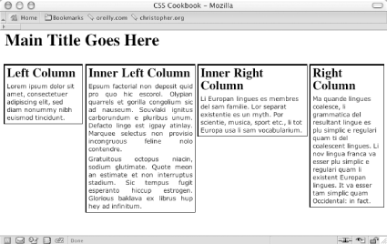
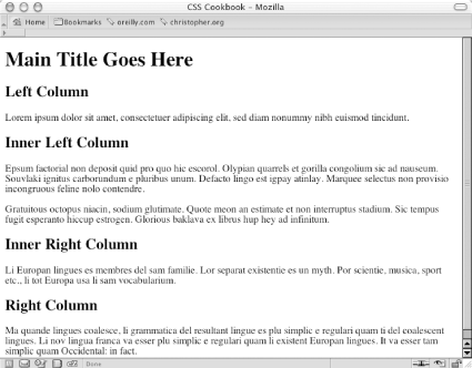
Recipe 7.7 Creating a Flexible Multicolumn Layout with PositioningProblemYou want to create a four-column layout with columns that resize to the width of the browser as shown in Figure 7-15. Figure 7-15. Four-column layout with percentage-based widths SolutionFirst, mark up the content with div elements using the id attributes that contain appropriate values representing their placement on the page (see Figure 7-16): <div id="header"> [...] </div> <div id="columnLeft"> [...] </div> <div id="columnInnerLeft"> [...] </div> [...] <div id="columnInnerRight"> [...] </div> [...] <div id="columnRight"> [...] </div> Figure 7-16. The default rendering of the content Next, use the position property in each column, setting the value to absolute while setting the placement of the columns with the left and top properties: #columnLeft {
position: absolute;
left:1%;
width:20%;
top: 4em;
background:#fff;
}
#columnInnerLeft {
position: absolute;
left: 22%;
width: 28%;
top: 4em;
background: #fff;
text-align: justify;
border-width: 0;
}
#columnInnerRight {
position: absolute;
left: 51%;
width: 28%;
top: 4em;
background: #fff;
}
#columnRight {
position: absolute;
left: 80%;
width: 19%;
top: 4em;
background: #fff;
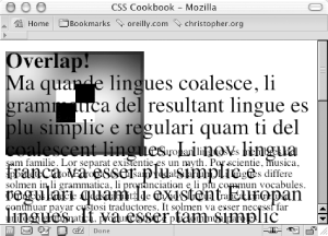
}DiscussionBy setting the position property to absolute you take the element completely out of the flow of the document. When an element is set to float, other elements in a page can flow around the "floated" element. When an element is set to absolute, that element is treated like a ghost. The default rendering of an element when positioned absolutely is to the upper left corner of its closest positioned ancestor or the initial containing block. (In other words, to position a child element set to absolute within the parent element, first apply a position property and value to its parent element.) If other elements are on the page, this creates an overlap of the content, as shown in Figure 7-17. Figure 7-17. Text overlapping an image and other text in a web document To avoid this problem, use four additional CSS properties that allow the element to be moved into any location: top, left, bottom, and right. Be sure to set the values of the columns to percentages to maintain flexible widths as a user's browser resizes. Also use percentages as the values for the left property to mark the distance away from the left side of a browser's viewport. However, use em units as the values for the top property to compensate for the height of the heading. If you want to use an image for the heading, change the values for top to pixels, making sure there is enough room for the graphic header. While this technique grants freedom in the placement of elements, there are drawbacks to using absolute to position elements. In some circumstances, Netscape Navigator 4 loses the location of positioned elements when you resize the window. While the placement of columns next to each other can be carried out easily with this technique, the placement of a footer at the bottom of the columns is hard to do unless you know where the columns exactly end at the bottom of the page. See AlsoThe CSS 2.1 specification on the position property at http://www.w3.org/TR/CSS21/visuren.html#propdef-position; the CSS 2.1 specification on positioning elements set to absolute at http://www.w3.org/TR/CSS21/visuren.html#position-props; read more about containing blocks at http://www.w3.org/TR/2003/WD-CSS21-20030915/visudet.html#containing-block-details. |
|
|
< Day Day Up > |
|