|
|
< Day Day Up > |
|
Hack 55. Visualize Google News
Watch stories aggregated by Google News unfold over time, coverage broaden and fade, and hotspots emerge and fade again into the background. Newsmap (http://www.marumushi.com/apps/newsmap) is a whizbang Flash-based treemap representation (http://www.cs.umd.edu/hcil/treemap/index.shtml) of the stories flowing through Google News. The Newsmap home page describes it best:
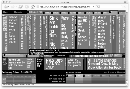
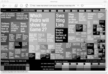
Point your web browser at the Newsmap page and click the LAUNCH button to begin. Figure 4-4 shows Newsmap in action. Figure 4-4. Newsmap's Standard banded layout, focusing on U.K. coverage of world, nation, and business news Each color-coded band (you'll have to take our word for its being in color) represents a Google News section: from top to bottom are World, Nation, Business, Technology, Sports, Entertainment, and Health. Notice that I've only selected the first three by checking their associated checkboxes at the bottom-right. Also notice that I've selected news only from the U.K. in the Countries tab across the top. The colors appear in a gradient from brightest ("less than 10 minutes ago") to darkest ("more than 1 hour ago") such that the latest stories stand right out. The more substantial the band and bigger the enclosed headline, the greater the number of related stories. You can easily spot the freshest and most covered stories: they're the big, bright blocks. Hover your mouse over any story for a brief description drawn from the primary sourcethe story around which others are clusteredas chosen by Google News. There's also a Squarified version (Figure 4-5) that I prefer: more so than with the Standard version (Figure 4-4), you are able to see the spread of coverage across all news categories. Switch between the two layouts by clicking the appropriate Layout button near the bottom-right. Figure 4-5. Newsmap's Squarified layout, drawing from U.S. coverage of news across all Google News categories Newsmap provides a fascinating bird's-eye view of news as it unfolds on the Web. Here are a couple of my favorite Newsmap settings:
|
|
|
< Day Day Up > |
|